Idenitity verification amongst older adults
ReadID, InnoValor
Summary
The SaaS platform ReadID allows users to verify their identity on a smartphone, by using the newest NFC technology. A good product is one that has the capacity to be accessible for all kinds of users. In this case study, the usability challenges that older adults experience when they make use of ReadID Ready are uncovered. Resulting in a more inclusive app design.
Client
ReadID, InnoValor
Role
UX researcher
Duration
October 2020 - July 2021
Background
ReadID is a product of InnoValor. Founded in 2013 and headquartered in the Netherlands, InnoValor is a privately-owned company. In 2014, they were the first company worldwide to launch NFC-based identity verification. Making our lives and our work easier and safer. That premise is always their main motivation for innovations. InnoValor aims to reduce identity fraud, and create a safe digital environment to meet demands for online identity-sensitive services. As no specific user research is conducted yet on groups of people for whom the usage of identity verification technology could be difficult, there is still a gap to be filled in. Being as inclusive as possible for all different kinds of users is of utmost of importance.
Problem Statement
The main goal of this project is to uncover the current challenges that older adults experience when they make use of the ReadID Ready application. Thus trying to enhance the current app in regards to user experience and inclusive design.
%20(1).png)
Process
During this research, a human centered design methodology is used in order to explore how to enhance the user experience of ReadID Ready application. Within this methodology, dilemma-driven design and scenario-based design play a key role:
Exploration →
Usability Studies →
Ideation →
Evaluation
Research
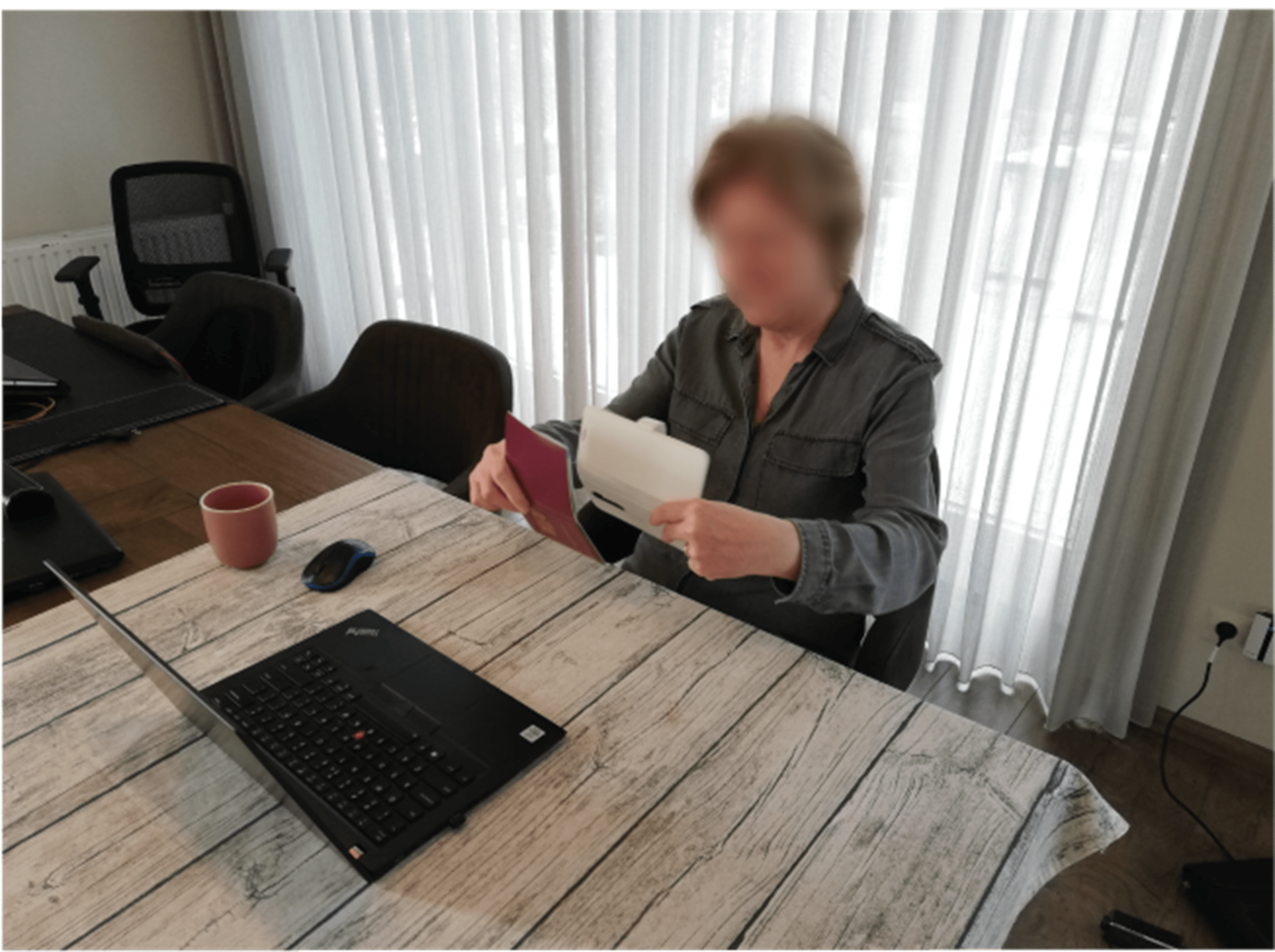
An extensive usability reseach with participants from the target group is conducted. First, as a sensitization exercise, users are questioned about their past experiences with identity verification. Second, participants need to conduct a task using the current version of the ReadID Ready app. Last, a creative brainstorm led by the researcher is held in order to generate new design ideas.
Result
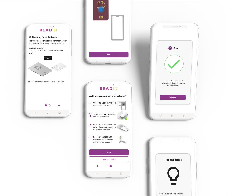
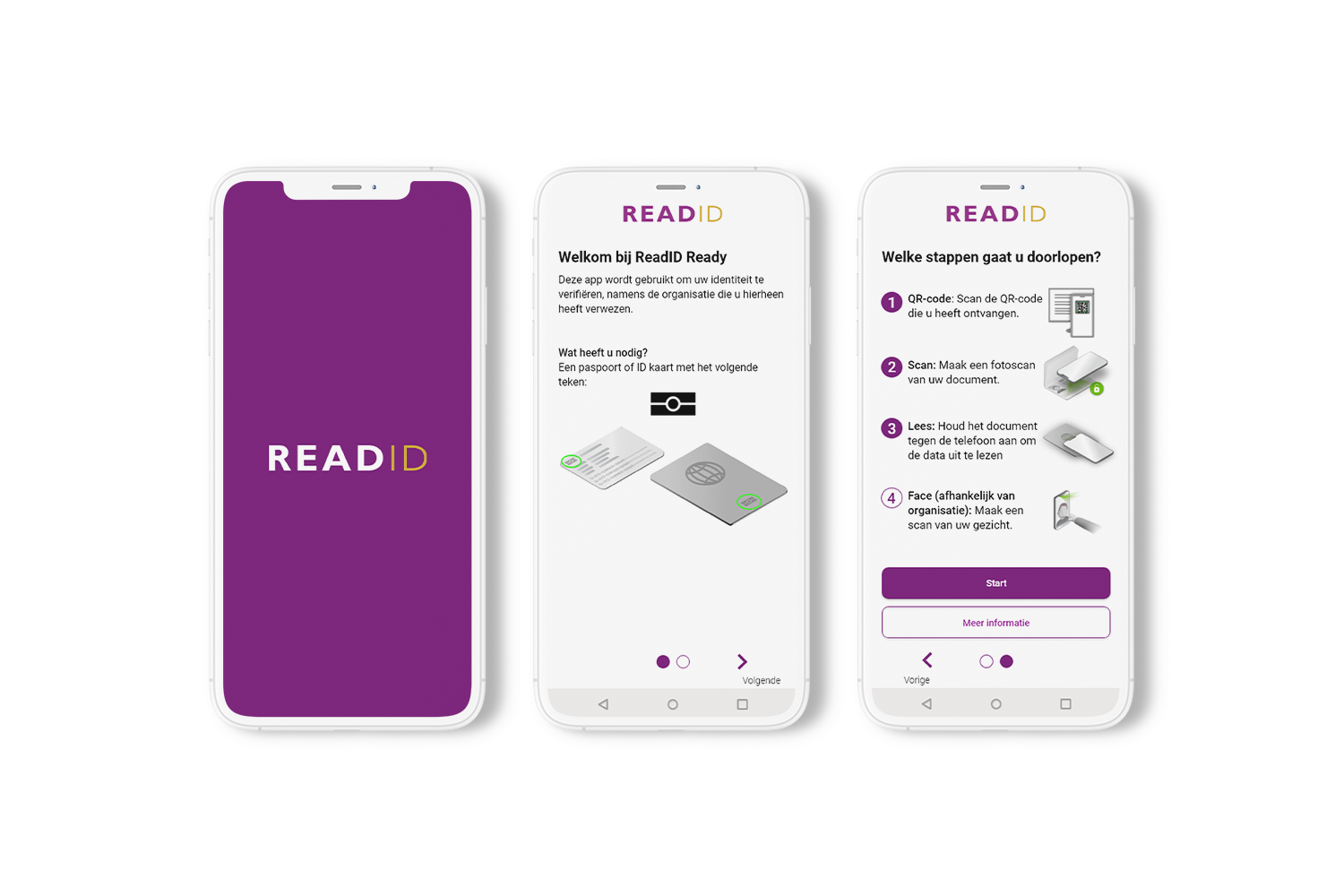
A new start screen has the potential to provide more guidance to older adults at the beginning of using the app. The design of this screen shows besides a general introduction, all of the steps that the user needs to go through in order to complete the process. By providing this extra step of guidance, the older user knows better what to expect. While the app is loading, a so called ‘splash screen’ is shown with the logo of ReadID
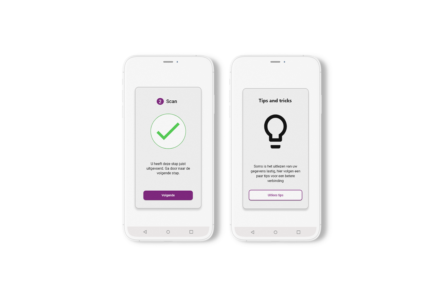
In order to provide the older adult with more positive feedback in the app, feedback screens have to be integrated in between the different steps. Older adults have to click on the ‘next’ button to proceed, giving them control over this screen. Likewise, a ‘tips and tricks’ screen tells the users that they will start looking at tips for completing the read step.
Download
The result shown above is only a small part of a complete Graduation Thesis. Download the Thesis to get a better understanding of this UX case study.